Analysing Logistics 7: Quantification of Events
This is really where we would begin, if the data are available (we should make it our job to obtain it from records if it isn’t given to us upfront).
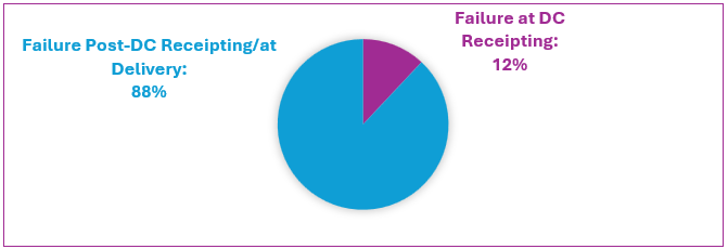
Helpful for identifying failure causality is quantitative data (Cadle et al., 2021; Chopra, 2019). Expressing internal data, this pie chart shows the proportion of orders failing at arrival at the DC (inbound) and post-receipting at the DC (outbound).

From this simple separation, we can observe the following:
- 88% of goods pass QC at receipting so are subsequently stored.
- 12% of goods fail QC at receipting so are returned to suppliers. (Those goods never get despatched to customers so cannot be a cause of order failure.)
- Overall, suppliers are not responsible for order failures.
- It appears that FNS is delivering faulty and/or late goods, for which operations at despatch and/or post-DC receipting must be responsible. (We need to know more, however, to be confident about this.)
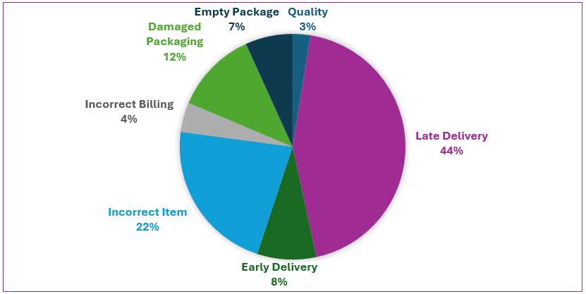
Now we must ascertain exactly why around half of the 88% of products that pass QC at receipting subsequently become failed orders. For this, we have to look closely at the reasons for order failure according to the data on customer complaints. This pie chart breaks down the proportional share of those reasons.

And so, categorised customer complaints reveal the reasons for order failure. This simple pie chart is valuable. It shows customer complaints as relative proportions, indicating which operations cause which kinds of order failure and with what frequency.
It appears that outbound logistics (delivery) has a lot to answer for!
